Plotting territorial income distribution and other demographic indicators in the city of Barcelona
The objective of this article is to analyze and plot choropleth maps of territorial income distribution and other demographic indicators in the city of Barcelona, obtained from the Barcelona open data repository using Python's Folium library. Here we only present the final results. A detailed technical implementation explanation is available in my Jupyter Notebook, and the source code is available in my Github repository.
1. Income distribution in the city of Barcelona
The first dataset that we are going to analyze is the Renta Familiar Disponible (RFD) index dataset. This dataset contains the Disposable Family Income Index by Neighborhood. The most recent one available to the public is from 2017. The table below shows the RFD index of every neighborhood.
| 1. Territorial income distribution in Barcelona (2017) | |||||
| Neighborhoods | RFD Index Barcelona = 100 |
||||
| BARCELONA | 100,0 | ||||
| 1. el Raval | 71,2 | ||||
| 2. el Barri Gòtic | 106,1 | ||||
| 3. la Barceloneta | 79,6 | ||||
| 4. Sant Pere i Santa Caterina | 99,4 | ||||
| 5. el Fort Pienc | 106,5 | ||||
| 6. la Sagrada Família | 101,8 | ||||
| 7. la Dreta de l'Eixample | 175,9 | ||||
| 8. l'Antiga Esquerra de l'Eixample | 137,2 | ||||
| 9. la Nova Esquerra de l'Eixample | 110,2 | ||||
| 10. Sant Antoni | 104,2 | ||||
| 11. el Poble Sec | 82,2 | ||||
| 12. la Marina del Prat Vermell | 40,0 | ||||
| 13. la Marina de Port | 69,3 | ||||
| 14. la Font de la Guatlla | 82,9 | ||||
| 15. Hostafrancs | 99,0 | ||||
| 16. la Bordeta | 79,0 | ||||
| 17. Sants - Badal | 81,0 | ||||
| 18. Sants | 99,0 | ||||
| 19. les Corts | 120,0 | ||||
| 20. la Maternitat i Sant Ramon | 114,2 | ||||
| 21. Pedralbes | 248,8 | ||||
| 22. Vallvidrera i el Tibidabo | 144,1 | ||||
| 23. Sarrià | 193,6 | ||||
| 24. les Tres Torres | 215,8 | ||||
| 25. Sant Gervasi - la Bonanova | 184,6 | ||||
| 26. Sant Gervasi - Galvany | 192,1 | ||||
| 27. el Putxet i el Farró | 144,6 | ||||
| 28. Vallcarca i els Penitents | 112,5 | ||||
| 29. el Coll | 87,0 | ||||
| 30. la Salut | 109,9 | ||||
| 31. la Vila de Gràcia | 104,4 | ||||
| 32. el Camp d'en Grassot i Gràcia | 105,7 | ||||
| 33. el Baix Guinardó | 92,0 | ||||
| 34. Can Baró | 83,3 | ||||
| 35. el Guinardó | 79,1 | ||||
| 36. la Font d'en Fargues | 92,5 | ||||
| 37. el Carmel | 54,2 | ||||
| 38. la Teixonera | 73,7 | ||||
| 39. Sant Genís dels Agudells | 84,1 | ||||
| 40. Montbau | 79,8 | ||||
| 41. la Vall d'Hebron | 95,8 | ||||
| 42. la Clota | 93,5 | ||||
| 43. Horta | 79,8 | ||||
| 44. Vilapicina i la Torre Llobeta | 63,8 | ||||
| 45. Porta | 64,4 | ||||
| 46. el Turó de la Peira | 51,9 | ||||
| 47. Can Peguera | 51,5 | ||||
| 48. la Guineueta | 53,8 | ||||
| 49. Canyelles | 52,2 | ||||
| 50. les Roquetes | 49,7 | ||||
| 51. Verdun | 51,3 | ||||
| 52. la Prosperitat | 56,0 | ||||
| 53. la Trinitat Nova | 48,2 | ||||
| 54. Torre Baró | 46,5 | ||||
| 55. Ciutat Meridiana | 38,6 | ||||
| 56.Vallbona | 40,9 | ||||
| 57.la Trinitat Vella | 47,1 | ||||
| 58.Baró de Viver | 68,9 | ||||
| 59.el Bon Pastor | 65,1 | ||||
| 60.Sant Andreu | 77,7 | ||||
| 61. la Sagrera | 77,1 | ||||
| 62. el Congrés i els Indians | 75,1 | ||||
| 63. Navas | 81,6 | ||||
| 64. el Camp de l'Arpa del Clot | 81,7 | ||||
| 65. el Clot | 83,6 | ||||
| 66. el Parc i la Llacuna del Poblenou | 100,4 | ||||
| 67. la Vila Olímpica del Poblenou | 164,2 | ||||
| 68. el Poblenou | 99,9 | ||||
| 69. Diagonal Mar i el Front Marítim | 150,1 | ||||
| 70. el Besòs i el Maresme | 60,4 | ||||
| 71. Provençals del Poblenou | 102,3 | ||||
| 72. Sant Martí de Provençals | 67,4 | ||||
| 73. la Verneda i la Pau | 57,0 | ||||
| Source: Ajuntament de Barcelona. Oficina Municipal de Dades. | |||||
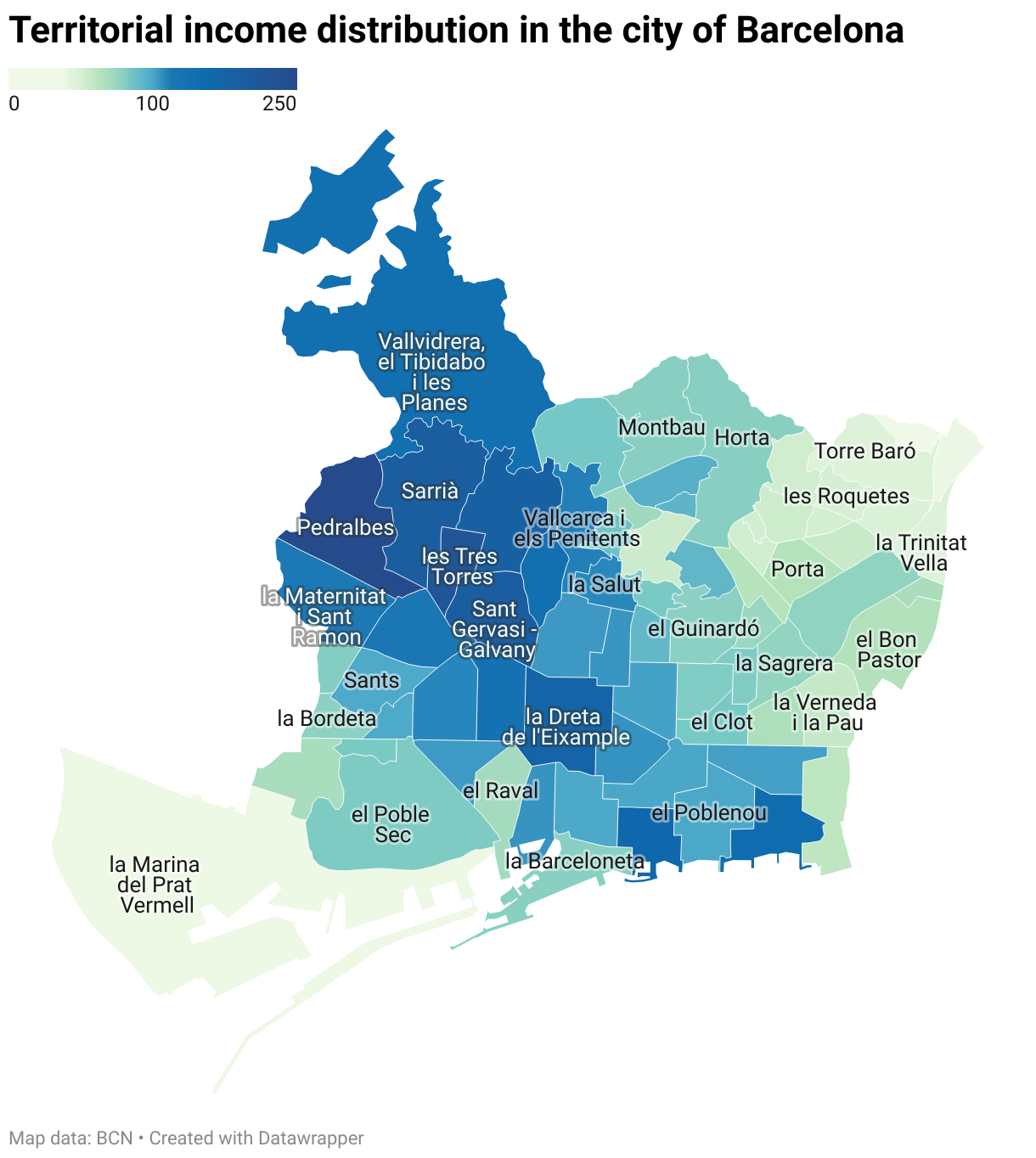
Here we present two different choropleth maps. The first one has neighborhoods colored from yellow to red according to their RFD index, as illustrated by the colorscale on top of the map. The second choropleth map uses two different colorscales to better differentiate neighborhoods with a lower than average RFD index from neighborhoods with an equal or higher than average RFD index. By placing the mouse cursor or clicking on the neighborhood, you can see the associated neighborhood name and its RFD index.
As we can observe, most of the neighborhoods in the north east or south part of the city have a RFD index lower than average, and the highest RFD index neighborhoods are located in the north east part of the city. 49 neighborhoods have a below average RFD index, and 24 neighborhoods have an equal or higher RFD index than average. The 3 highest RFD index neighborhoods are Pedralbes, les Tres Torres, and Sarrià, with an RFD index of 248.8, 215.8, and 193.6 respectively. The 3 lowest RFD index neighborhoods are Ciutat Meridiana, la Marina del Prat Vermell, and Vallbona, with an RFD index of 38.6, 40.0, and 40.9, respectively. These maps indicate that there is significant income inequality among the neighborhoods. We can check if this inequality has been increasing or decreasing over the past years by comparing with RFD index datasets from previous years.
The oldest dataset available in the repository is from the year 2007. Therefore, we compare the RFD index of the year 2007 with the year 2017 to calculate the percentage change of the RFD index over the past 10 years. The first choropleth map illustrates the RFD index, and the second choropleth map illustrates the RFD percentage change. Both maps use two different colorscales to differentiate the neighborhoods.
The income distribution in 2007 was very similar to 2017. 50 neighborhoods have a below average RFD index, and 23 neighborhoods have an equal or higher RFD index than average. The 3 highest RFD index neighborhoods are les Tres Torres, Pedralbes, and Sant Gervasi - Galvany, with RFD index of 215.3, 193.6, and 187.0 respectively. The 3 lowest RFD index neighborhoods are Baró de Viver, Can Peguera, and Vallbona, with RFD index of 44.5, 49.8, and 51.6 respectively. Some of the low-income neighborhoods had a positive RFD change, such as Baró de Viver, with a positive RFD change of 54.83%, and some of the high-income neighborhoods had some minor negative RFD changes, such as Vallvidrera, el Tibidabo i les Planes, with a RFD change of -1.57%. However, overall, inequality among different neighborhoods has clearly increased over the last decade. Most neighborhoods in the north-east part of the city have experienced a decrease in the RFD index. Low income neighborhoods in 2007 are even relatively poorer in 2017.
Besides RFD index dataset, we also have disposable household income per capita by neighborhood available in public, the oldest one is from year 2015 and the most recent one is from year 2019. Choropleth maps below indicate the disposable income of these two years.
The absolute value of disposable income in 2019 is clearly higher than in 2015. However, the overall distribution is basically the same as with the RFD index choropleth map of 2017 and 2007. Most of the highest income neighborhoods are in the district of Sarrià-Sant Gervasi, and most of the lowest income neighborhoods are in Nou Barris, which is basically the same as in the previous RFD index maps.
2. Other demographic and relevant indicators in the city of Barcelona
In this section, we plot other demographic and relevant indicators. The firs two dataset we use is the Immigration registration rate (‰ inhabitants) and Birth rate (‰ inhabitants) in the city of Barcelona. These two rates are the relation between the number of immigration or birth registrations in one year and the population of that same year per thousand inhabitants. The Choropleth maps below plot these two rates for the most recent available year, 2020.
Most of the neighborhoods have an immigration rate between 30 to 50 per thousands inhabitants and a birth rate between 4 to 8 per thousands inhabitants. Compared to the income choropleth maps above, immigration and birth rates do not seem to have a clear correlation with the income level of the neighborhoods. The highest immigration rate is in a low-income neighborhood, el Barri Gòtic, and the lowest immigration rate is also in a low-income neighborhood, Can Peguera. Most of the highest birth rates are in low-income neighborhoods, but there are also plenty of low-income neighborhoods with very low birth rates.
Finally, we plot the life expectancy rate by neighborhoods. The most recent one available in public is from the period of 2015 to 2019.
The life expectancy difference among neighborhoods is pretty significant, with the lowest neighborhood having only 78.1 years of life expectancy and the highest neighborhood having 87.7 years of life expectancy. Most of the high-income neighborhoods have a high life expectancy, with Vallvidrera, el Tibidabo i les Planes as an exception. Most parts of the city, including the majority of neighborhoods with a below average RFD index, have a life expectancy of around 85 years. The 3 lowest life expectancy neighborhoods are in the lowest income neighborhoods, which are Vallbona, la Trinitat Nova, and la Marina del Prat Vermell, with life expectancies of 78.1, 79.6, and 79.8 years, respectively. The 3 highest life expectancy neighborhoods are Pedralbes, la Vila Olímpica del Poblenou, and la Maternitat i Sant Ramon, with life expectancies of 87.7, 87.4, and 86.7 years, respectively. Their corresponding RFD indexes in the year 2017 are, 248.8, 164.2, and 114.2, respectively.
To check if the life expectancy is related to the number of hospitals and health centers in the neighborhood, we plot a cluster map of hospitals and primary health services of the city of Barcelona. Most of the hospitals and primary health services are in the center of the city, high income areas seem to have few hospitals and primary health services more than low income areas, however, this difference does not seem to be very significant.
Final words
In conclusion, in this article we have provided some choropleth maps to illustrate some interesting statistics in the city of Barcelona. Some observations are also provided based on the results of the maps. The main goal of this article is to introduce a powerful visualization technique to help visualize lengthy information in a more accessible way. The income distribution dataset that we used has been placed by Open Data BCN into the United Nations Sustainable Development Goals 1: No Poverty and Goals 10: Reduced Inequality. As we have observed, even neighborhoods within the same city can have significant income inequality. Furthermore, when compared to historical data, we can see that income inequality has been increasing over the past years. Therefore, more efforts are needed to achieve the reduced inequality goal.
Thank you for reading this far! Feel free to contact me for discussion or any doubts regarding the code!